
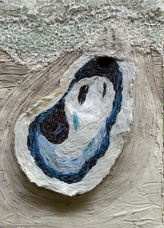
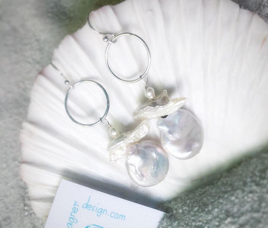
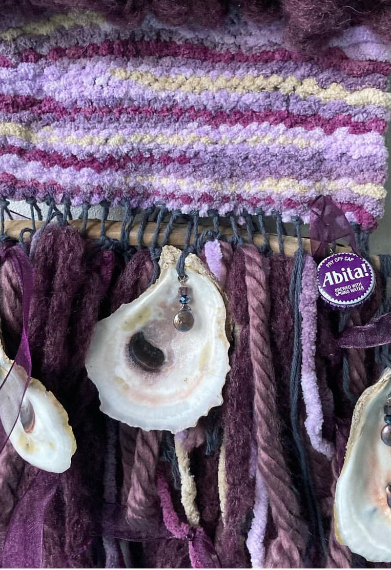
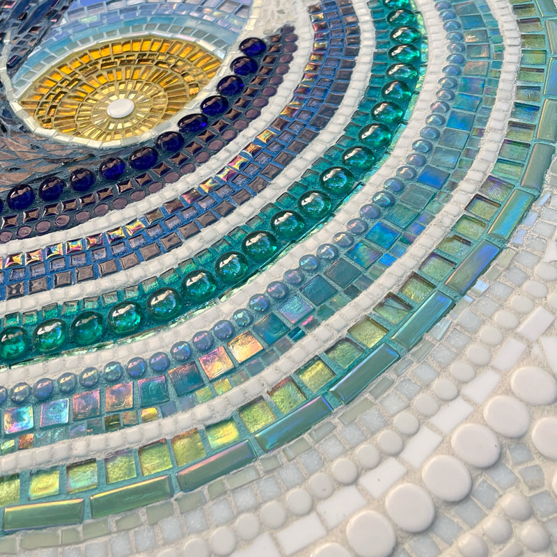
 I have a love/love relationship with oysters. I love them fried, baked, raw, plain, dressed up with cheese, on a cracker with Tiger Sauce, and especially freshly shucked and grilled over an open flame by the shore.  I also love oyster shells. I love the organic asymmetry of the shell. The lines, forms, and shapes that inherently appear in nature almost always speak to my soul before that of manmade perfect symmetry, unless it’s in the form of a mandala, another love. And of course, I love an oyster’s little treasured gift, the pearl. The fact that a beautiful pearl originates from a tiny, unwanted piece of grit is fascinating. Again, I like misshapen, organic pearls the most. Keshi, blister, stick, and coin pearls are preferred over the perfectly rounded pearls of your grandmother’s tightly strung necklace. Through the years, I’ve also created my share of oyster crafts-an oyster Christmas tree, jewelry dishes, napkin rings, ornaments, and jewelry. You can also find a few oysters in my woven art panels. Last Christmas my daughter asked me to paint a watercolor of an oyster for her. I don’t claim to be a painter, but she was pleased with the gift. 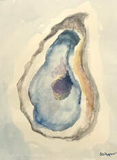 That watercolor, along with a gluttonous afternoon stuffing my face at the Fort Morgan Oyster Fest here in Alabama, inspired me to create my latest mosaic project: Grit, a 22" x 30" 3-D wall hanging of an oyster. You can scroll to the end of this post to watch a quick time lapse of this mosaic coming together, or if you are a mosaic nerd, you can stick with me for the step-by-step process. 
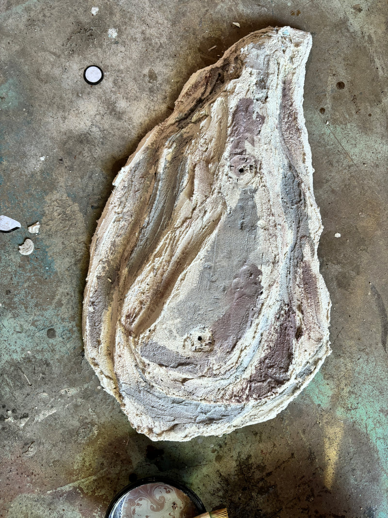
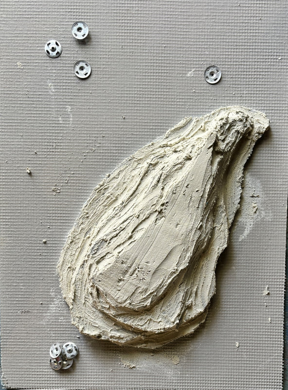
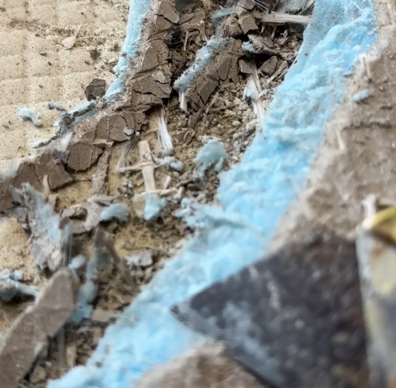
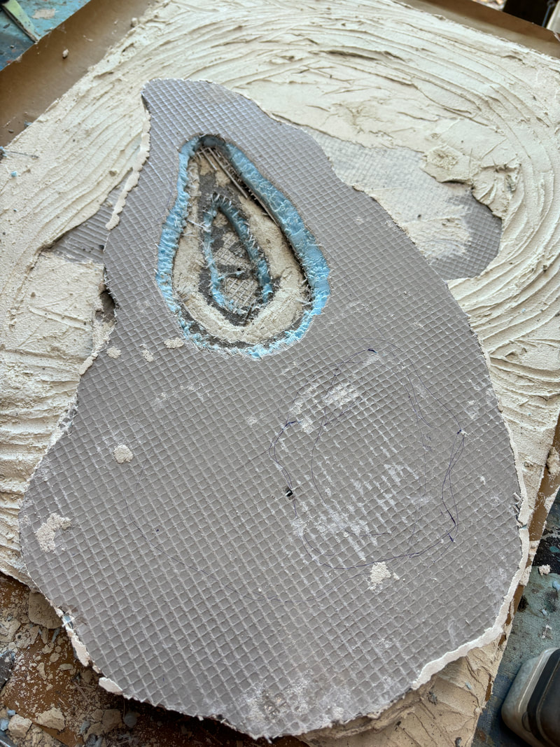
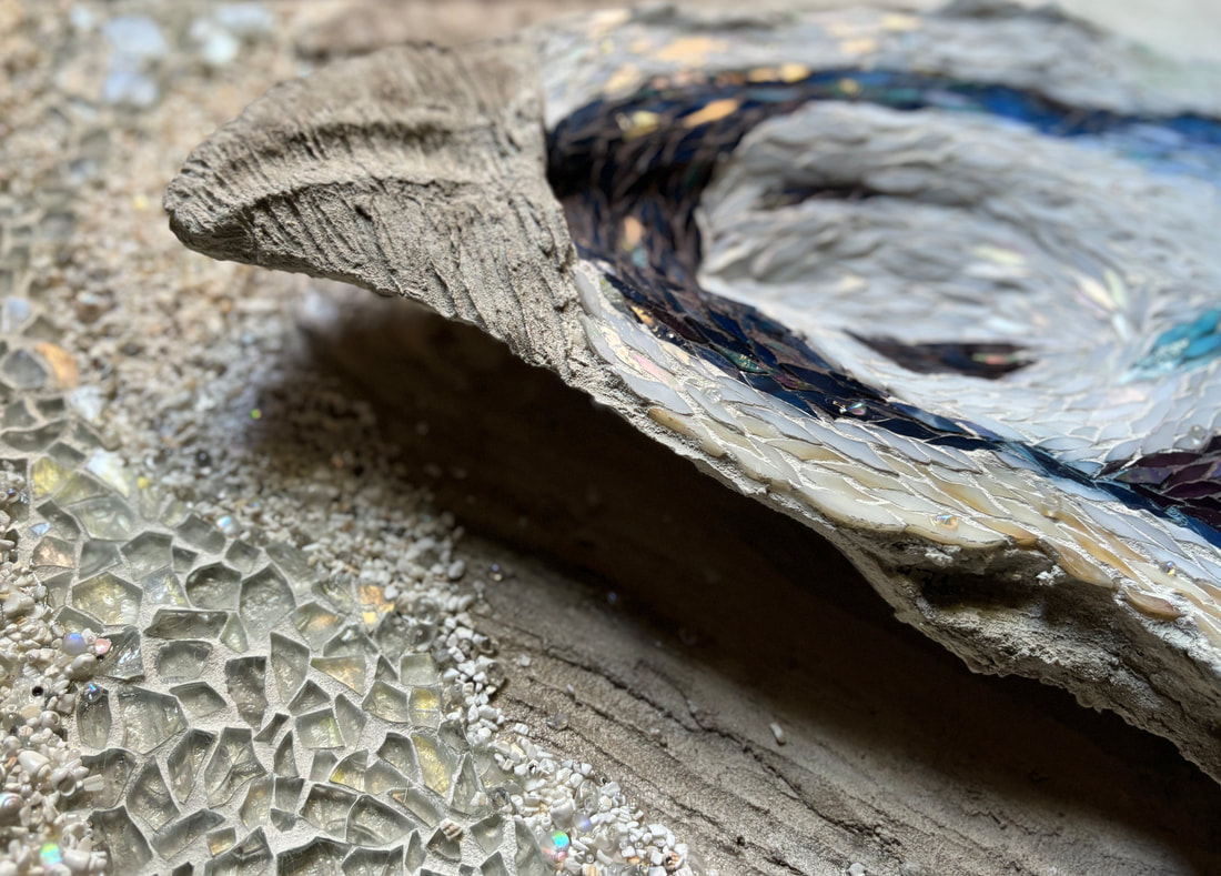
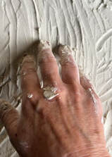 Then, I added a skimcoat of thinset over the entire background and fingerpainted some watermarkings into the ”sand.” 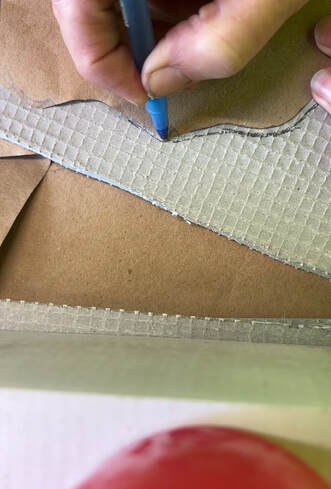 I drew out a rough shape of an oyster on paper, cut it out, and traced it onto another piece of foam board. My plan was to graduate each layer, so I repeated this process three times, with each layer slightly smaller than the previous one as it stacked downward. I then adhered these pieces to each other using a combination of thinset and Weldbond. Next, I carved out an indentation with an assortment of blades, mimicking the scoop that exists in many oysters. This process was a mess and I initially questioned whether I had made the right call. I then installed more Wedi hardware in two places on the front side of the sculpture before affixing two more washers to the backside of the substrate. This was only after trips to numerous hardware stores to find a screw that was both long enough to go through the entire oyster and background, and the fit correct diameter for the Wedi hardware. 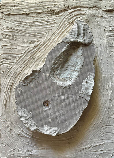 I used Apoxie Sculpt to add some dimensional scalloped edges and to smooth out the indentation, followed by another skimcoat of thinset over the entire outer surface, and carved some details into the "hinge" portion.
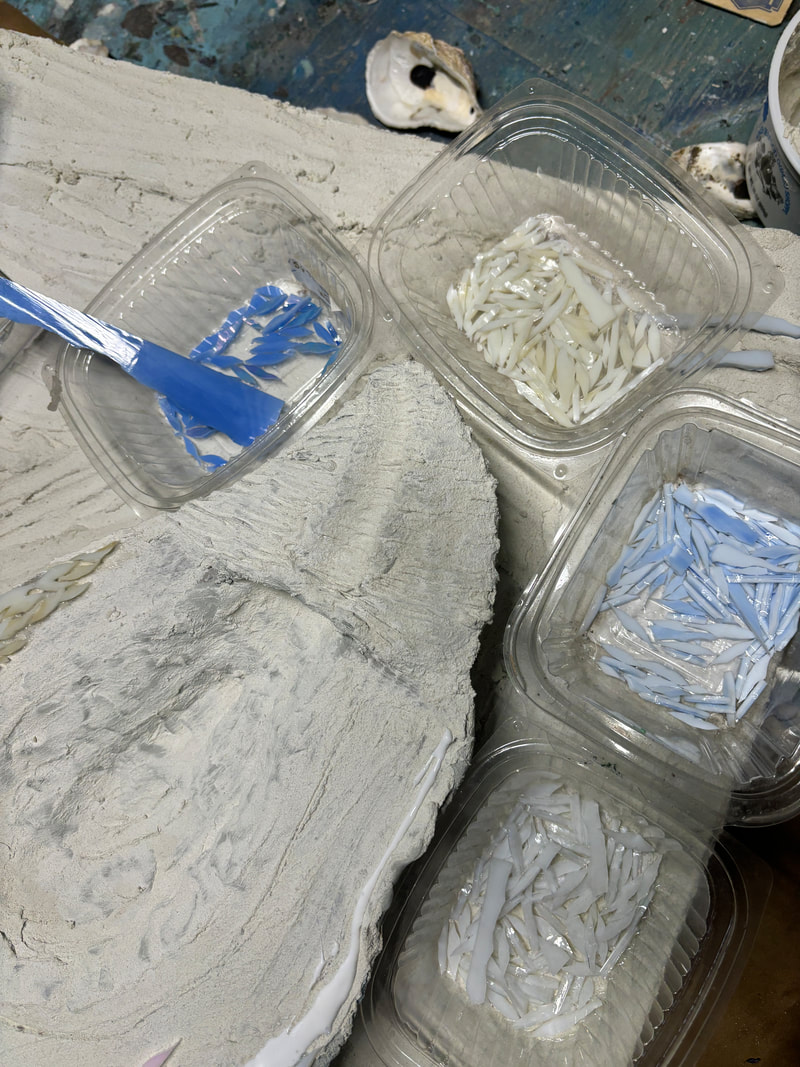
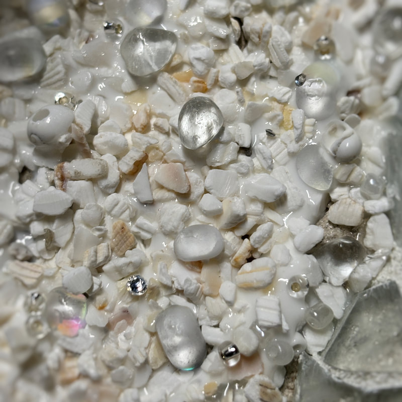
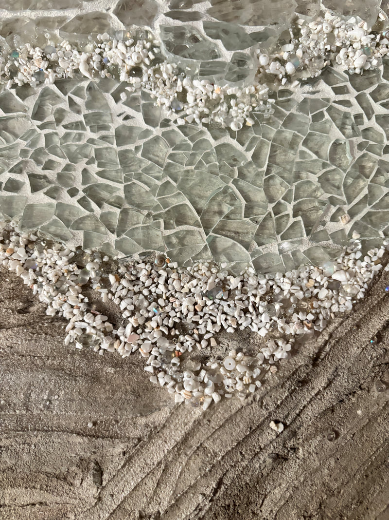
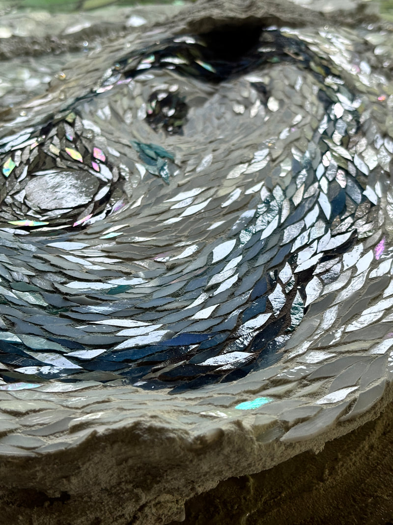
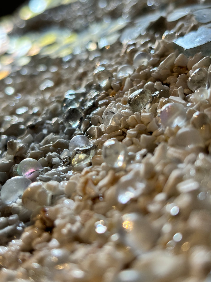
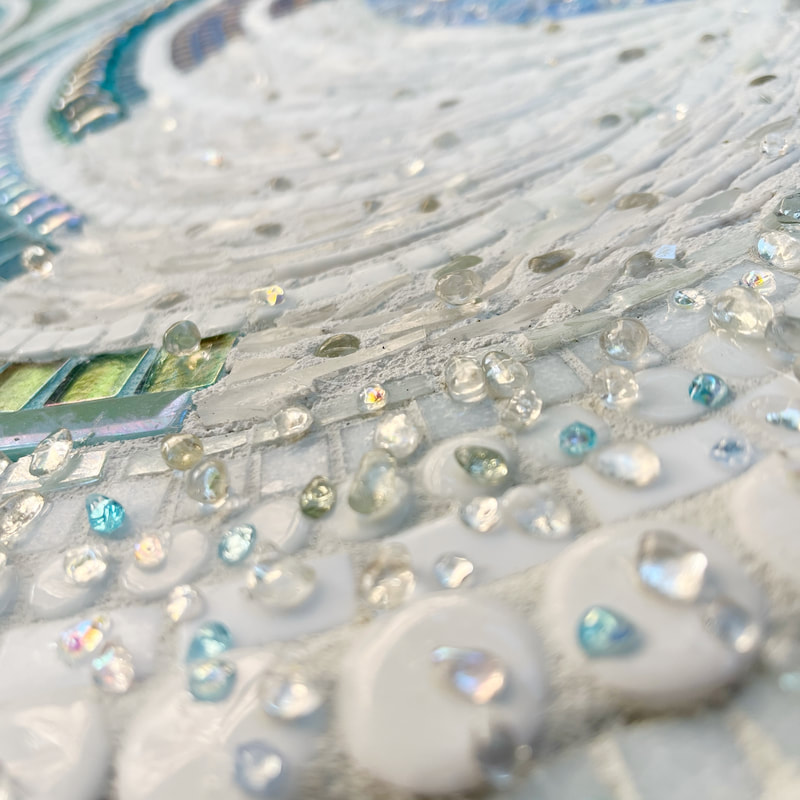
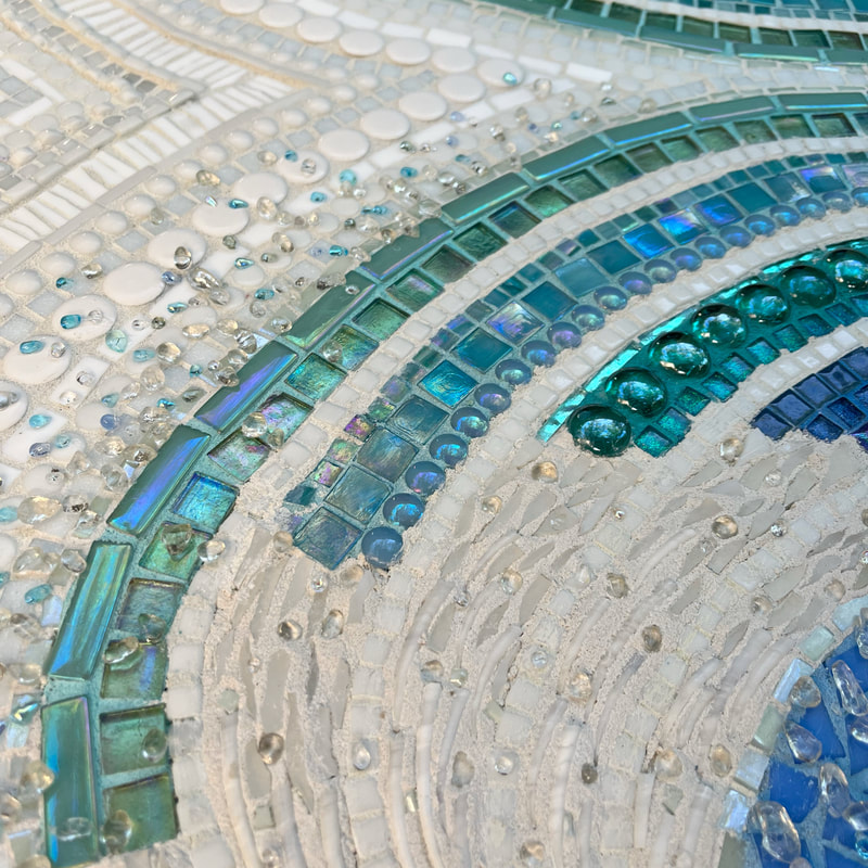
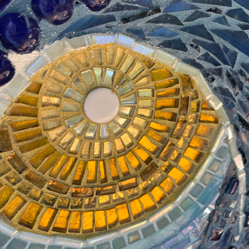
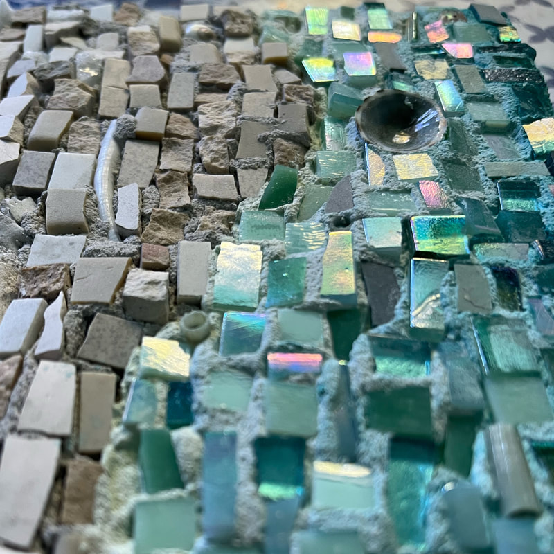
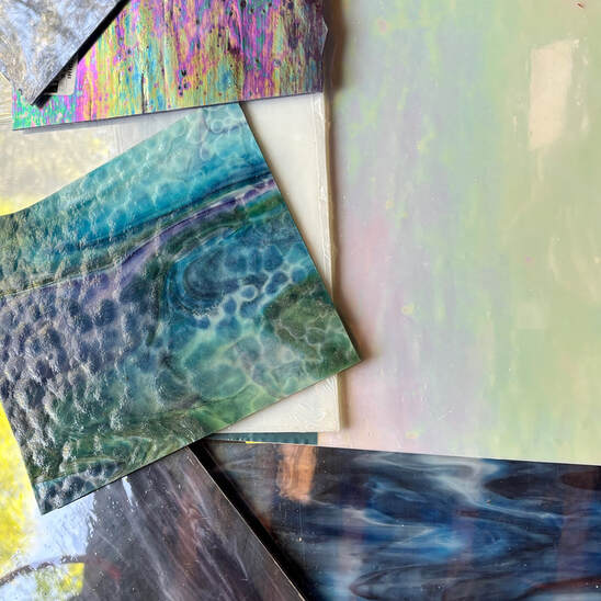 I used hand cut stained glass, which in this instance meant I started with sheets of stained glass and then manipulated them into the tiny tesserae. With the palette in my watercolor serving as inspiration, I chose to use more blues as opposed to purples. I added some sparkle with just a smattering of iridescent glass. My cutting technique was an adaptation of one I learned in a workshop with the amazing mosaicist Yulia Hanassen.(<< Click on that link. She creates wonderful work). This cut lends itself to the curvature of an oyster, far better than that of traditionally square tesserae. Though this piece involved a tremendous amount of planning and cutting, once I started adhering, it came together fairly quickly. I was indecisive about what to do with the background, so I left that for last, but finally opted to render water with two different sizes of tempered glass. These shoreline waves were enhanced by a “foam” composed of tiny glass beads, shells, and just a few sparkly crystals. After I finished with the tesserae, I tinted the color of the sand numerous times to try to replicate the look of wet sand surrounding the oyster, and then added a sheen to some parts with Weldbond. 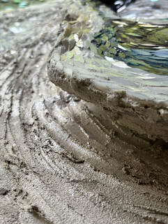 Below is a video of the piece coming together, followed by a few of my favorite closeups. Oh, and lastly there is a poem, (insert eyeroll). Many of my mosaics have an accompanying poem. Some mosaics were inspired by my poetry and others lent themselves to verbiage. This is the latter. Zzzzzzzzzzzz Ooops, I accidently just hit the “z” while typing. I think I may leave it in here for some of you. Kind of appropriate at this point in this rather lengthy post, and serves as foreshadowing for the dark poem below… What the Shuck? I am the irritant Trapped inside myself Slowly transforming Layer by layer Well-worn, marred On the outside Pry me open Uncover nothingness Or perhaps a tiny pearl Hidden within the gelatinous mess of my mind, Unhinged. Did you make it to the end? Did you roll your eyes? Are you still awake? P.S. I'm in a good place, I just like to write poetry that's on the darker side. Thanks for stopping by, 
1 Comment
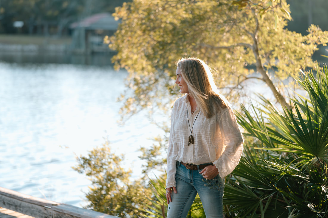
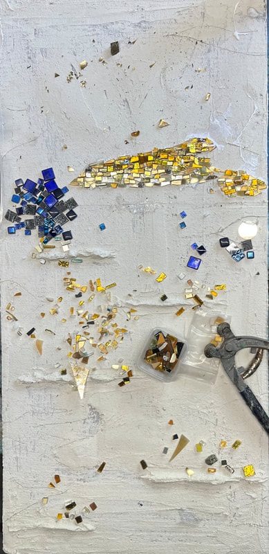
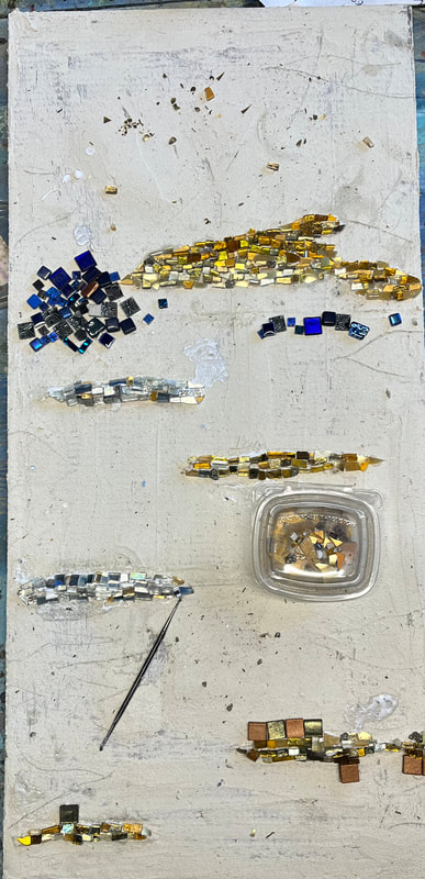
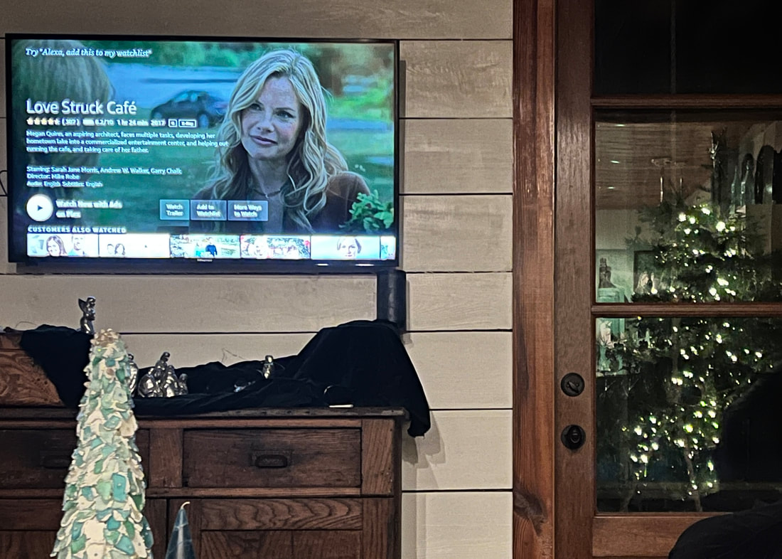
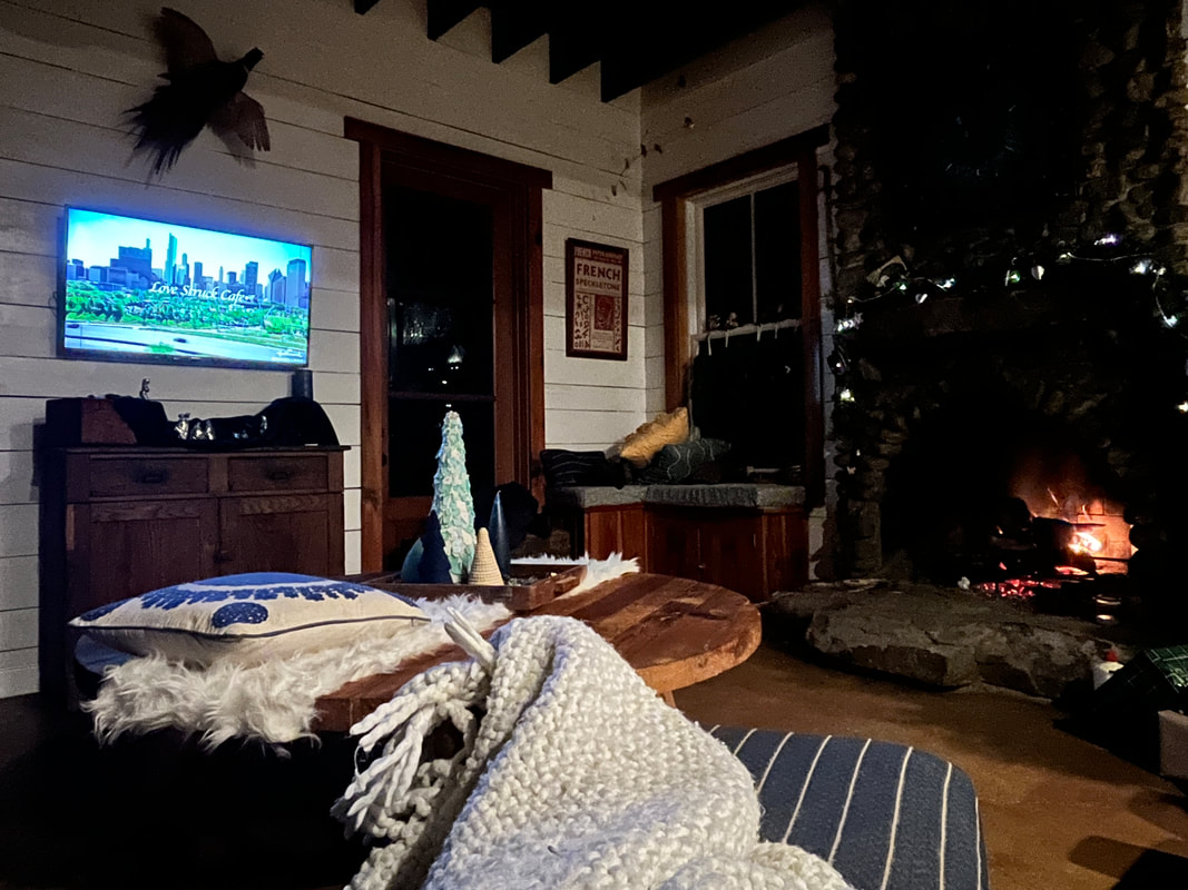
I’ve always been the family archivist and photographer. I am highly critical of the few photos that manage to catch me in front of the camera. My recent Facebook profile photo had not been changed in 6 years, and before that, it was a photo of my art. With my recent milestone birthday approaching, I decided to bite the bullet and hire a professional to try to get at least four photos of myself that I didn’t hate before my crepey skin consumes me. My goal was to get a decent photo of me with my artwork for my website, one with my daughter, one with my dog, and one by myself. This was a Christmas surprise for my husband, so he wasn’t included in this mix. My son lives in another state, so we’ll work on one with him later, too. I'm not gonna deny the embarrassing vanity here, I own it, but I’m only going to get older and less photo worthy. The only time as an adult other than our wedding day when I had my photo professionally taken was when I cashed in my Glamour Shot coupon in the 90’s. Need I say more? Still cringeworthy, but at least I refused the feather boa and silly hats. It was as "tasteful" as I could make it given the array of props they were pushing. I found this current photographer with a “professional photographers near me” google search. She was the first person to pop up. I was intrigued because though she is near me, she is also a North Carolina native and graduated from the same university that I did. It was fate. Below are four photos I don't hate, though the photographer delivered ten-fold. I'm not posting for comments. And believe me, there was an ongoing debate with myself whether to post at all. But then again, I don't think too many people manage to find their way to this blog. I'm posting to say it was worth it. Find the courage to just let all the self-deprecation go for an hour or two, Do it for your partner. (He did appreciate the gesture). Or your children. Or posterity. Or dammit, just effin’ do it for yourself. Or that slide show at your funeral. Ooooh. Yeah, I went there, and I said it. But it’s true, and that clock is ticking... Here is the link to my photographer: https://www.emilybarrettphoto.com/ Thanks for stopping by,  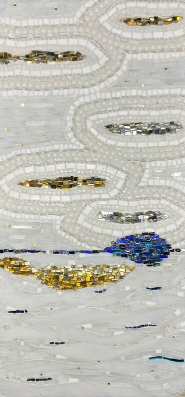 Okay, I’m going to admit that sometimes I can’t believe how much of an idiot I can be. (Insert my eye roll and headshake here). Last fall, I finished a mosaic before a pending shoulder surgery. I probably should have bypassed mosaic work, but I knew I would be sidelined after surgery. I wanted to squeeze in one more piece of art if I could. There wasn’t too much cutting involved because of the shoulder issues. And, honestly, because I usually prefer to alter most precut tiles I use, this piece is not one of my favorites. Because of its orientation, (which is where my idiocy comes into play), I’m having some trouble embracing the finished piece, though I do love its color palette of white, gold, and blue. 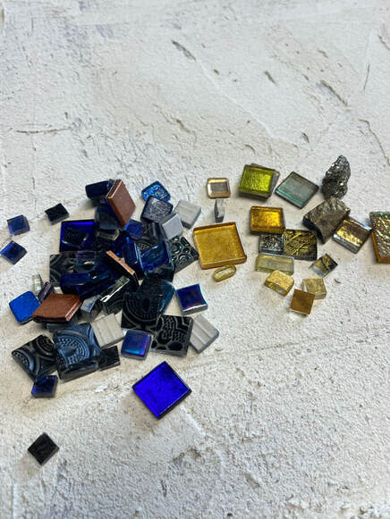 My substrate was Wedi board, which requires pre-planning for hanging. One must think through and secure the hanging mechanisms before beginning the mosaic. I did this, and decided to use pronged t-nuts and D-rings. 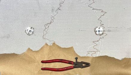 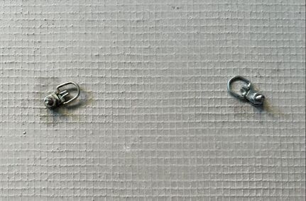 I then gave the entire front side a skim coat of thinset and built up a few dimensional “berms” in various spots of this intended abstract. So far, it was headed down the path I had planned. I began laying the tesserae (bits and baubles of glass), excited and anxious to knock this out. I worked on it for an hour or two in the evenings plus some time on the weekends. 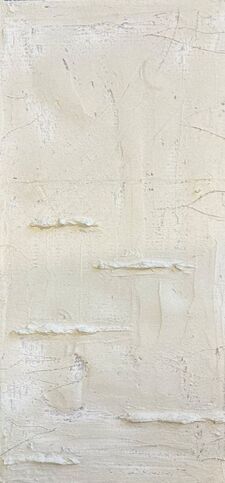 When I was about seven hours in, I needed to reposition the entire board on my worktable. I picked it up with its backside facing me and noticed the hanging mechanisms were inserted into the bottom part of the board. Wait, what? But I had put them on the top, and the blue was to be placed in the top section. Only it wasn’t. I had been in such a rush that I had built up those berms without checking to see which end was up. I had started to place the tiles onto my substrate, still without a glance at the back. It wasn’t until I picked it up to move it that I caught my mistake. Granted, it's an abstract, but damn, that is not the orientation I wanted. Ugh. I had to pivot, and the intended top had to become the bottom and vice versa. I was too far along to start over, or rip things off. It is “fine," and of course no one would know by looking at it that it’s upside down, but I just really prefer the other orientation. It is slowly growing on me, and the white background is peppered with little bits of 24 karat gold tesserae, which I do love. The blue included beautifully iridescent pieces, and the silver is reflective with some textured mirror incorporated. The textured sections were not meant to be clouds, but toward the top they do appear cloudlike to me, and the blue line looks a bit like a horizon line. Again, not as abstract as I wanted, but that’s okay. The name of this piece is Pivot. I guess that’s what we are required to do more often than we’d like. There’s a lesson in here somewhere: Slow down, take a deep breath, and learn to pivot. Here is a short video of how the piece evolved: Thanks for stopping by,   My first job out of college was at my hometown television station. I worked my way in to the Promotion Department, which is where I had interned and first met Rob. The Promotion Department served as the in-house advertising agency and my colleagues were young, wise-cracking creative people that were just plain fun to be around. Rob's quick wit made our days productive but full of laughter, and the nights were usually spent hanging out at the local pub with others from the station. Rob taught me how to edit video tape when I was an intern and coached me on the finer nuances of delivering a concise and (hopefully) entertaining 30 second promotional spot. This was back in the days when you needed an entire crew of maybe five to seven people to articulate what was in your head as a writer/producer. These spots were designed to get more people to watch our station and programs, which would result in better ratings that would convince advertisers to spend their money with our station.  The old WLOS TV station Just a year older than me, Rob was tall, smart, nice, and armed with a journalism degree from the University of Georgia. He was a romantic who wore his heart on his sleeve. Rob’s close friends and I would sit back while Rob evaluated the romantic potential in many of the pretty new hires that graced the doors of the old mansion in which the station was located. Sometimes, he would land himself a date, and he always remained hopeful that it would turn into something more. And that something more was akin to a classic movie script from yesteryear. Rob's soul lived in the wholesomeness of decades past.  Rob had professional dreams that were bigger than our station and he moved on to a bigger market. He met one of his celebrity crushes (SJP) at a booked appearance and she convinced him to go after his real dream of being a screenwriter. He took her up on that and moved to California. He soon published a few short stories in the Chicken Soup for the Soul series, and published a few other books and stories, too.  I clearly remember the day when I opened my mailbox and there was a promotional postcard promoting a holiday movie called Secret Santa. Rob was the screenwriter for the movie. No surprise here. He was still on his quest and had moved his heart from his sleeve to the screen. I live in a rural area, and at that time we had terrible tv reception, no cable, and did not have satellite. I was so disappointed that I couldn’t watch. But I was proud of my friend. He was making his dream come true. We eventually lost touch, but when Facebook became a thing, we reconnected, albeit only with a few "likes" here and there. At some point, one of us finally reached out for a more personal connection and we caught up on each other’s lives. Rob had enjoyed some success and had found his niche continuing to write wholesome, romantic, holiday movies. I realize that some holiday movies get a bad rap for being formulaic, but who doesn’t like a movie with a happy ending? My daughter and I have a tradition of cozying up by the fire and watching these movies during the holiday season. I didn’t realize how many of them had been written by Rob. 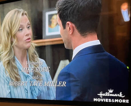 I last spoke with Rob this past summer, and he had just left California to start a new job outside of the industry. I wondered if it would fulfill his need for creativity, but was hopeful the move was the new start he needed. The last few years have brought quite a few losses to many of us including our family. Because of this, I’ve been on a mission to tell my family, and friends both current and from my past, how grateful I am that our paths crossed. Believe me, it is rather awkward to stumble through those words, but I did that with Rob on that phone call. I had no idea that it would be our last. I learned that Rob died suddenly mere weeks after that call, soon after settling into his new locale. I am heartbroken. This holiday season, please gather up your loved ones and tell them how much they mean to you. Just celebrate the magic of the holidays, schtick and all, and enjoy the innocence of my friend’s movies. I’ll be toasting with my cup of hot chocolate. Thank you, Rob.  Here is a list of his movies: Three Days Secret Santa 2003 (There has been a remake) Farewell, Mr. Kringle Christmas Cookies Marry Go Round Hidden Places Mortuary Girl When Christmas Was Young A Summer Romance Love Struck Café Hope at Christmas Here is his professional bio: https://www.imdb.com/name/nm1086699/bio/?ref_=nm_ov_bio_sm And his obituary: https://everloved.com/life-of/robert-tate-miller/ And an interview I found: https://www.fictionfinder.com/author_interview/read/interview_with_robert_tate_miller Thanks for stopping by,
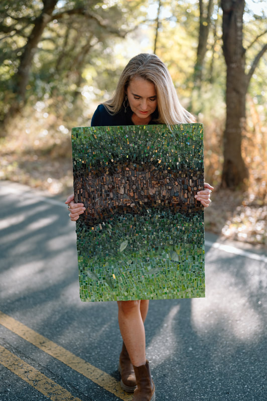
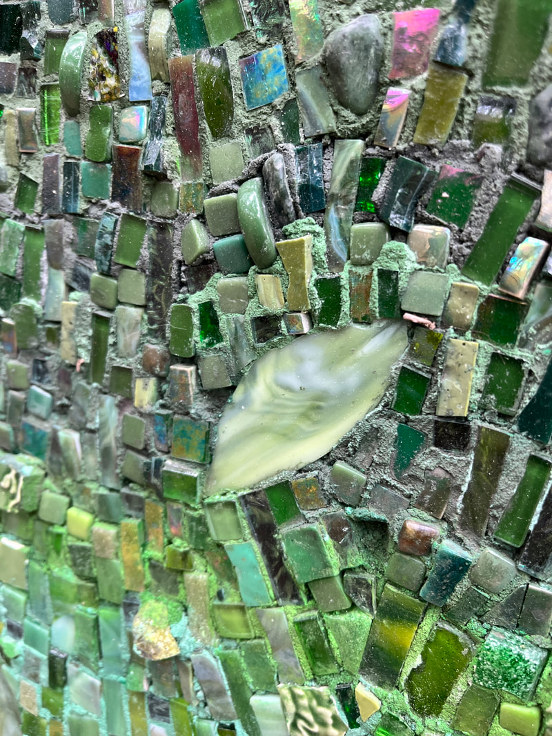
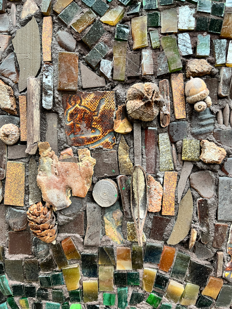
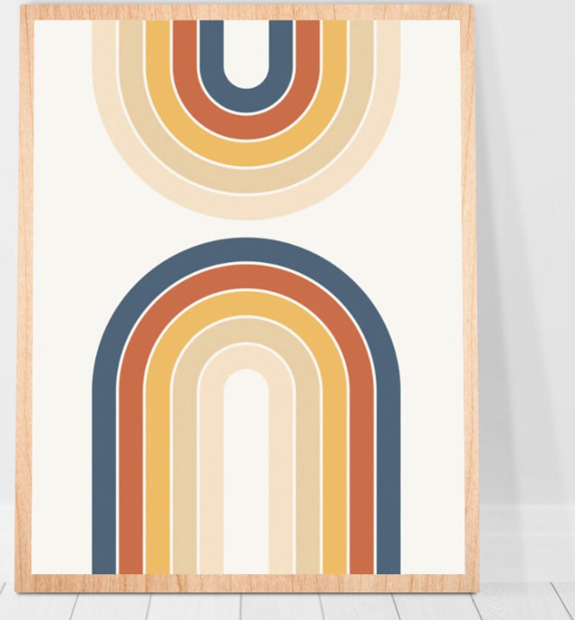
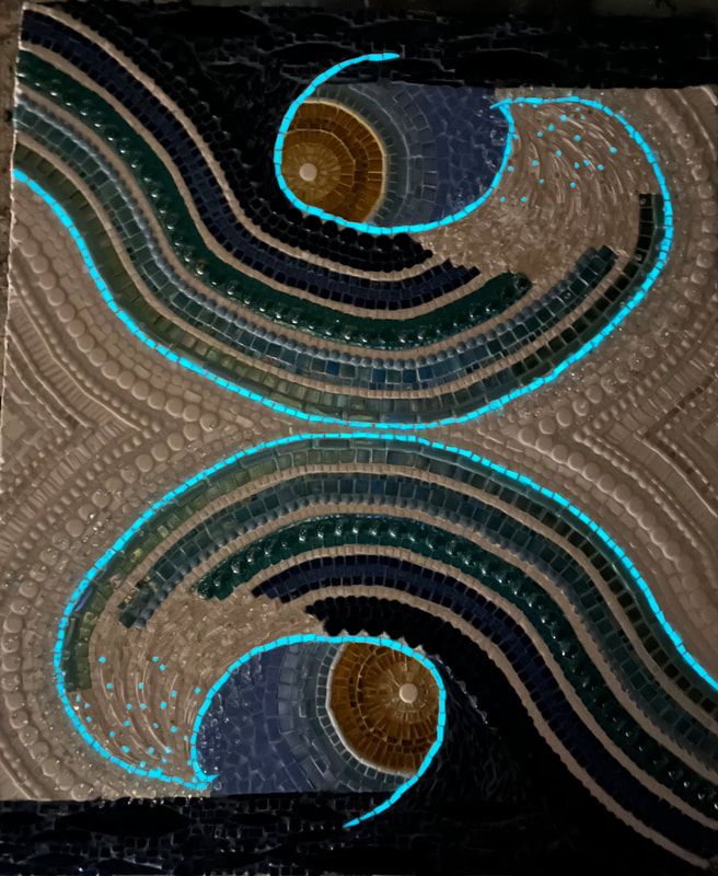
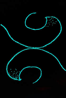
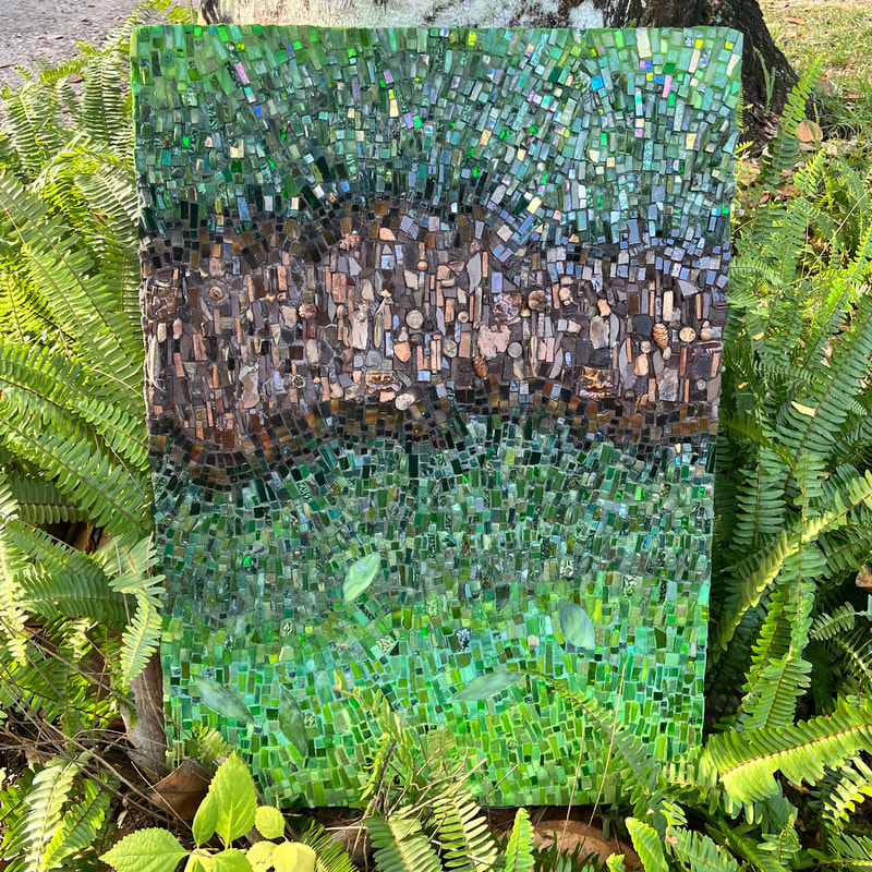 I recently completed the mosaic, And Through the Woods. Personally, it’s a nod to my beloved Blue Ridge Mountains, but generally, it’s a nod to anyone’s walk in the woods. As a transplant to the coast, I have spent decades feeling my blood pressure lower as I dig my toes into the sugar white sands and gaze out at the waters of the northern Gulf of Mexico on a coast that is now my home. But I get just as much “ahhh…” when I crest a hill whose peak gives me that first glance at the mountains of my youth, and ultimately leads to a steady calm as I settle into my destination among them. I love a hike in the woods, whether it’s with limey new growth emerging in the spring, when I’m cooled by the shade of towering evergreens in the summer, or while hearing my boots rustling through the fallen leaves of hardwoods. I admit I do give a hard pass to those bitterly cold, blustery, winter days on a trail, unless it's in the solitude after a snowfall. To me, a walk in the woods is more than just trees and leaves. There are clear cycles of life, decay, geology, and sometimes, even history if you look hard enough. And Through the Woods incorporates a few of these elements and discoveries, beginning with its chosen color palette. The varying greens obviously relate to plant life, and the browns to the forest floor- a catch all for decaying leaves, bark, and other treasures. 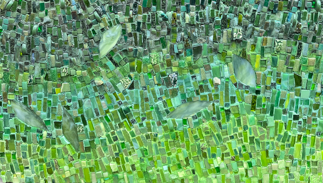 This piece is highly textured with the tesserae adhered into thinset, which means the piece doesn’t need grout. My preference is usually to use a different adhesive, and then grout. I am extremely messy with thinset, and it always requires more cleanup than I had planned. I used various glasses for most of the green section, including hand cut stained glass, modified pre-cut tiles, found glass, smalti, and mirrored glass, but I also incorporated some stone, and broken ceramic. There is quite a bit of “sparkle” in the green sections, merely because I like a little bling in a mosaic. The swath of brown also includes glass, but collectively it reads as more of a matte finish with sticks, acorns, brick, Native American pottery chards, ceramic, seed pods, bark, rusted metal, and wood. 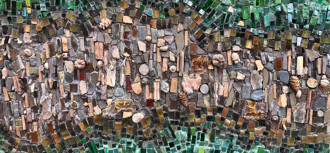 Below are a few close-ups and a short timelapse video of the piece as it came together. Each edit represents roughly one hour’s worth of work. You may not notice a lot of visual change between some of these hours/edits, as they might involve scraping, re-working, or re-tinting thinset, (and possibly cursing). This piece measures approximately 21" x30" and is currently available for purchase. 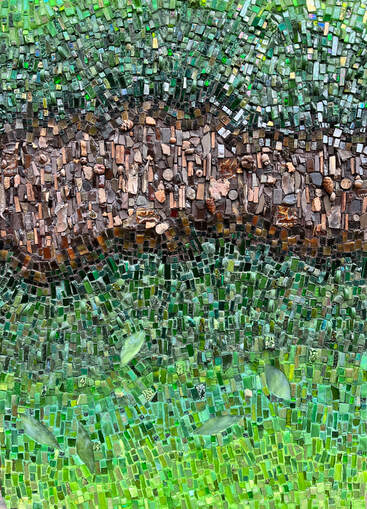  Thanks for stopping by,  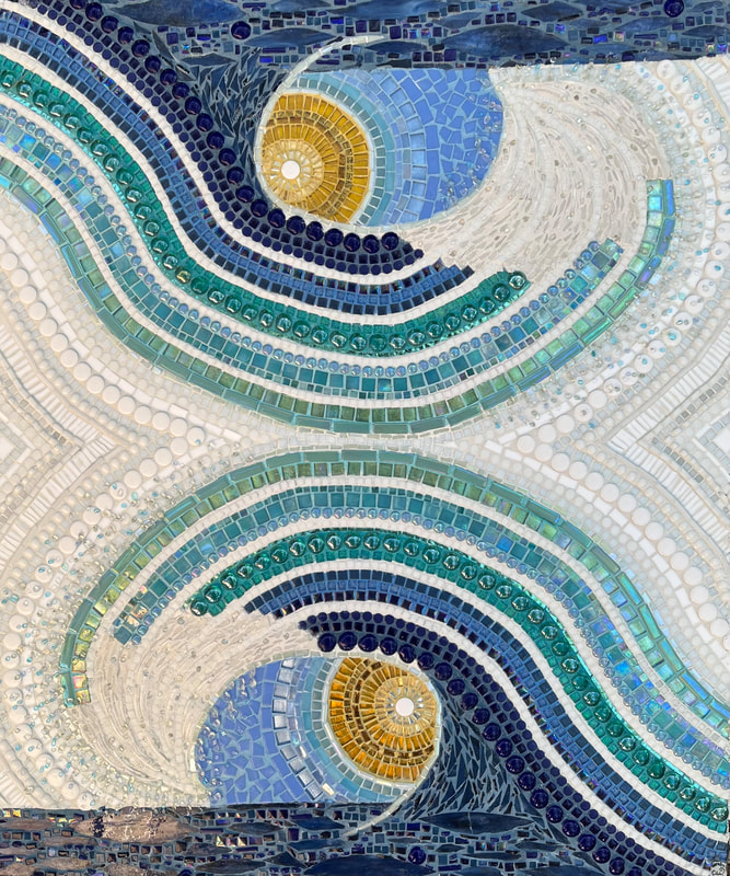 Here’s the backstory on my most recent piece, #sofun. I was inspired by a seventies style retro rainbow like these that I spotted in a store. The rainbow prompted me to think of how I could design a wave in the same style. It involved a little math and lots of planning. I started by painting a few different designs. I honestly find the top design more pleasing, but felt like the lower design was more on par with the retro vibe I was seeking.  An added challenge was the fact that I am currently nursing a partial tear in my LCL (forearm), a chronic case of tennis elbow, and various shoulder issues. This meant I had limited use of the usual array of mosaic cutting tools and had to use a lot of precut tiles. I prefer to cut most of the tesserae that I use for mosaic, but for this particular design, the uniformity of precut tiles helped me to keep the design on target and forced me to rest my arm. 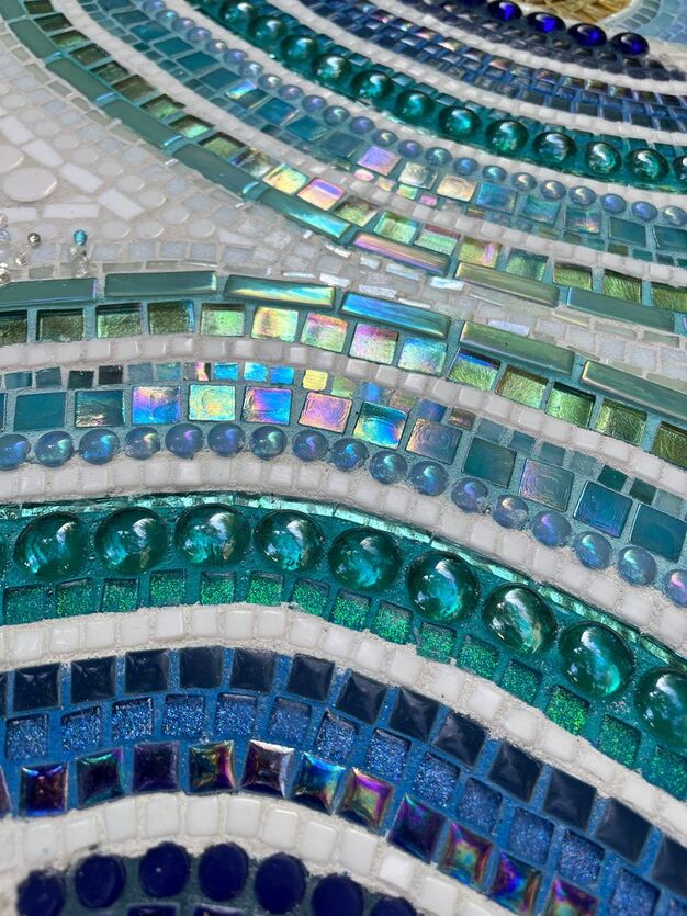 I’ll spare you all the methodical and measured details that were necessary in its creation, but it involved a several stages of taping, grouting, re-taping, and more grouting to get the reversed mirror image. 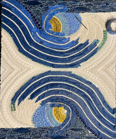 You can watch it come together if you visit my instagram page. I am having technical difficulties getting the video to directly load here. The instagram link is below. www.instagram.com/reel/CrWd4DzOkL3/?utm_source=ig_web_copy_link I’ve also included a few closeups of the finished piece. Besides glass, I incorporated some tusk shells into the white curvature of the breaking wave, and enhanced that with glass droplets and tiny little split teardrop glass beads to give some dimension, and suggest the splash. 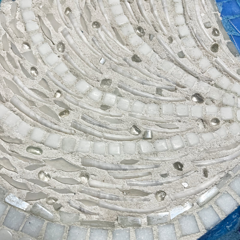 The top and bottom of the wave are outlined with glow in the dark glass, and I embedded a few glow in the dark glass chips within the splash.
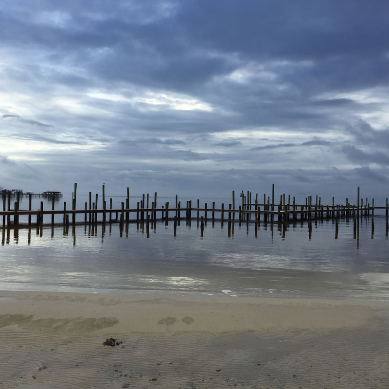
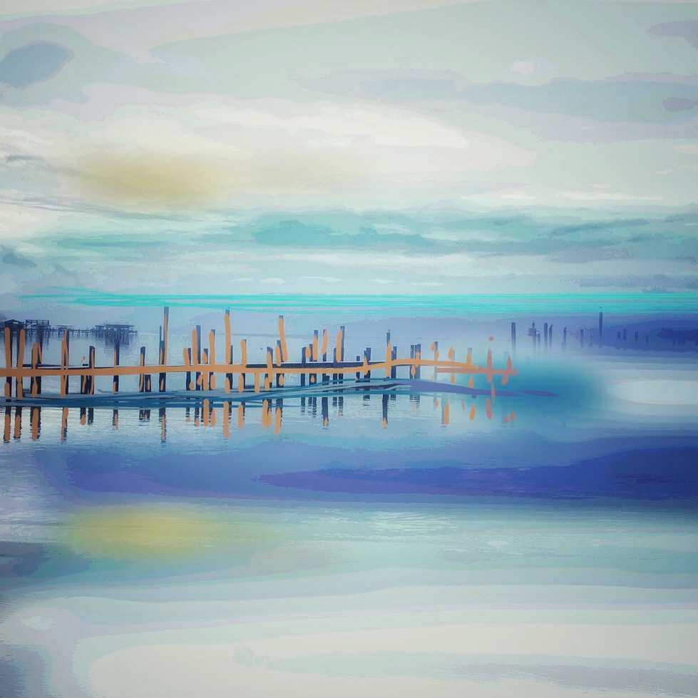
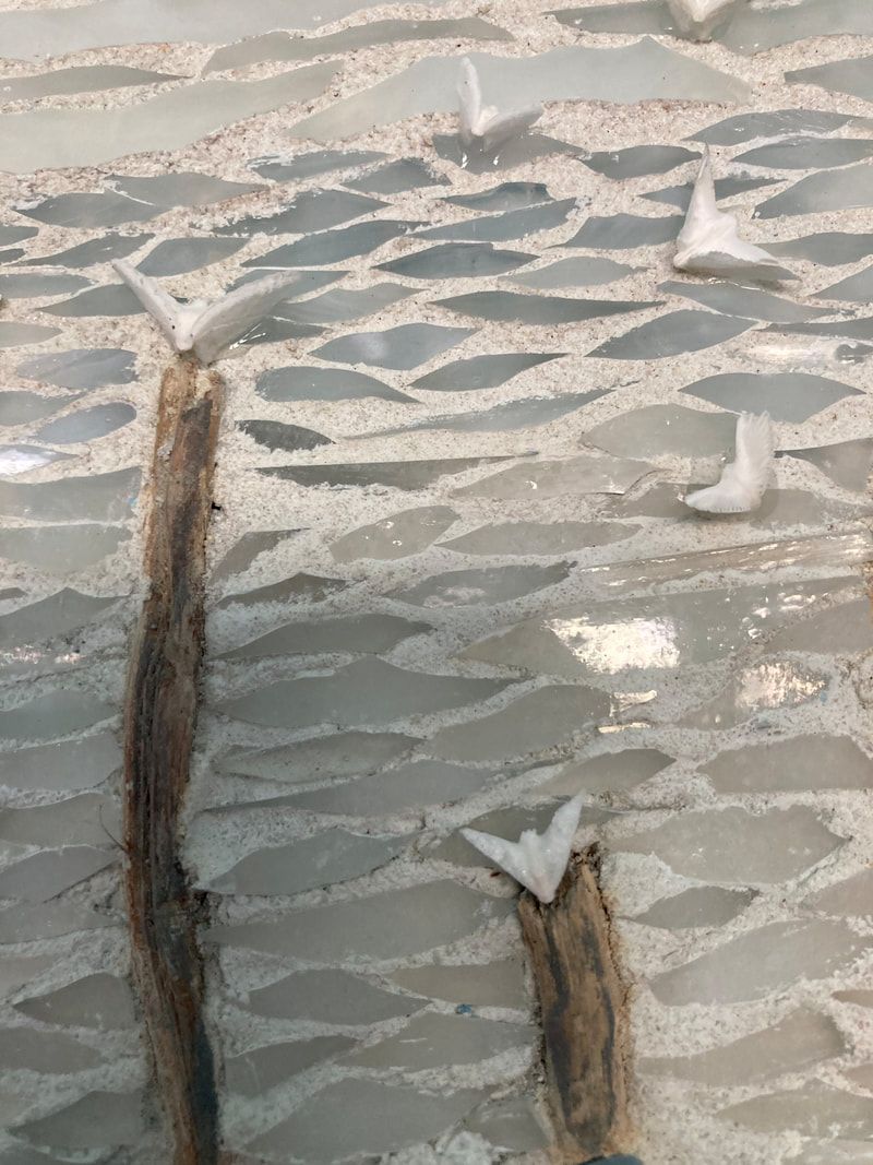
I created this piece with the intention of selling it but I've decided to keep if for a while. To me, it embodies the fun of living at the coast and I just don’t get enough chances to hang out on our beautiful beaches. Thanks for stopping by,  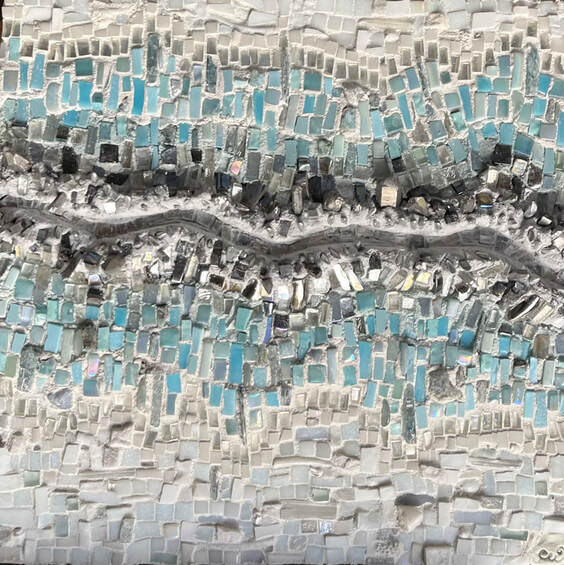 I recently finished Faultline, pictured above. When I blog about a piece of my art, I usually start with the process and photos. Then, if there is an accompanying poem, I post it at the end of my blogpost, (only if I’m feeling courageous. I’m still not very comfortable with sharing poetry in public). In this post, I’m starting with the words. With Faultline, I wrote the poem over a decade ago. A lifelong friend who also enjoys writing poetry and I have recently been exchanging a few poems, and this is one I dug out of my poetry vault. I decided to finally create a mosaic visual to go along with it. You can scroll down for more photos or hang in here with me while I describe how I arrived at the above work. First, the preface to the poem: (Actually, it serves as the preface to any poem I write). “One summer, I challenged myself to write a few poems. I enjoyed the process and have continued to compose them, using insight from my own experiences as well as inspiration from friends looking for love, or running from it. For whatever the reason, at an early age, I was given the role of trusted confidante, privy to intimate secrets, or sometimes burdened with dark truths I’d rather not know. Each allows me to empathize, my mind easily slipping on another’s shoes, be they well-worn or shiny new. I do this mostly while wide awake when I'd rather be sleeping...” I figure that this is my “alibi” of sorts, so it might remain a mystery if I wrote a particular poem about myself or not. Chances are, if you are reading it here, it's not. Some of my friends admit secret delight in the sometimes vengeful poems written on their behalf. Don’t mess with my friends, or I may come after you with some barbed words. Your Faultline This fissure did not come without warning A chasm not so sudden to ones so keen Plates shifted beneath foundation Long before it tumbled. Rumblings taking place deep within a buildup of layers Maybe not audible, But sensed. Closer inspection Not surprisingly reveals two sides. Once together, now separate Never equal Souls, actions, words, regrets Echo across canyons of reflection Go Stake the other side It’s yours And I don’t want it Faultline is about any estranged relationship be it romantic, platonic, familial, generational, or with colleagues or supervisors. It’s a fact of life that not all relationships last, and we can be grateful for the positive ones that do make it through the muck, and there will be muck. Respect commitment, but recognize toxicity. As I write this post in the aftermath of another horrific school shooting, I’ve realized that the meaning of this poem may also be interpreted to apply to situational divides. Sadly, human nature seems to first look to blame a side, a person, or a belief, just to gain understanding of events that have blindsided them or shouldn’t have happened. To illustrate the poem, I first lay down a meandering asymmetrical line of reflective tile. 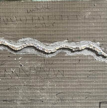 I then built up two sides into which I could embed some “chaos”. This chaos consisted of a lot of chunky reflective silvers, which included stones like galena and quartz and mica, glass beads, and broken pottery. 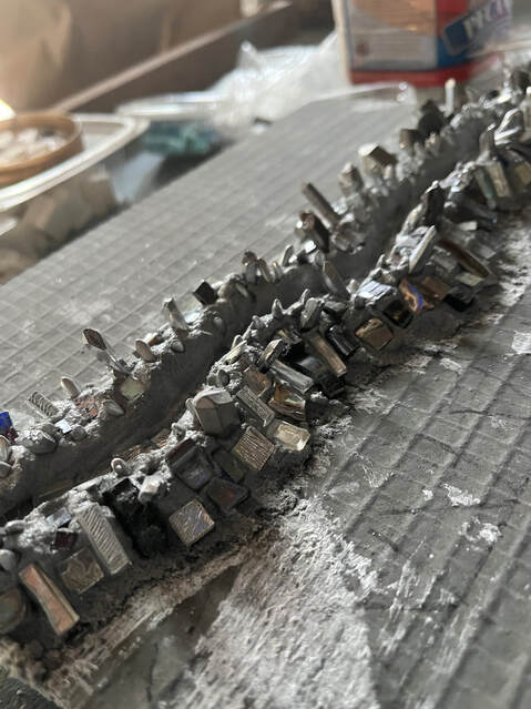 These silvers transitioned into blues which included glass, unglazed porcelain, kyanite, and larimar. The blues were bordered by an edge of reflective mirrored glass. 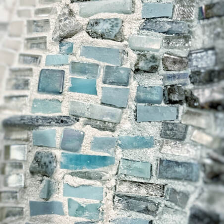 Finally, the piece transitioned into white, my favorite palette. This white portion was mostly made up of glass, but also included stones like selenite and marble. To finish it off, there is a smattering of coastal elements including shells and coral. 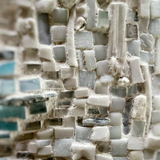 I am happy with the way this piece turned out. I like that it illustrates the words of the poem, but the overall palette of the piece and contrasting dimension allow the piece to stand on its own without its deeper backstory. I hope the viewer can share an appreciation for what I find to be its intrinsic beauty. Below is a video of how Faultline came together. Thanks for stopping by,  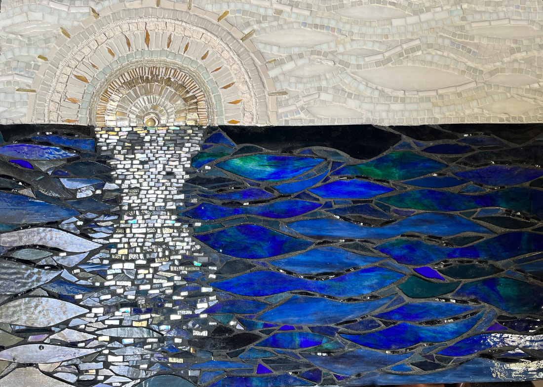 Here’s a look at my latest piece, Sound of Sunshine. I live in a coastal community and take loads of photos which inspire my art. I get neither sunrise nor sunset from my property. However, I can take a short walk to the bay to get both. These beautiful sunrises and sunsets teem with brilliant color, but every so often the sky is devoid of much color. As I frequently do, I took liberties with the true colors from my inspiration photo and “dumbed it down," so to speak. My plan for this piece was to be more abstract with a white sky and blue water, but I had an assortment of beautiful gold tesserae and I just couldn’t help myself. 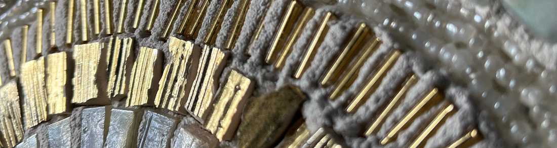 Ditching my initial abstract plan, I put the sun into the composition. In fact, I even ended up starting the mosaic by creating the sun first. Not my intention, but I started this piece just as the new year was beginning, and it seemed a bit metaphorical, i.e., new dawn, new day, new year. 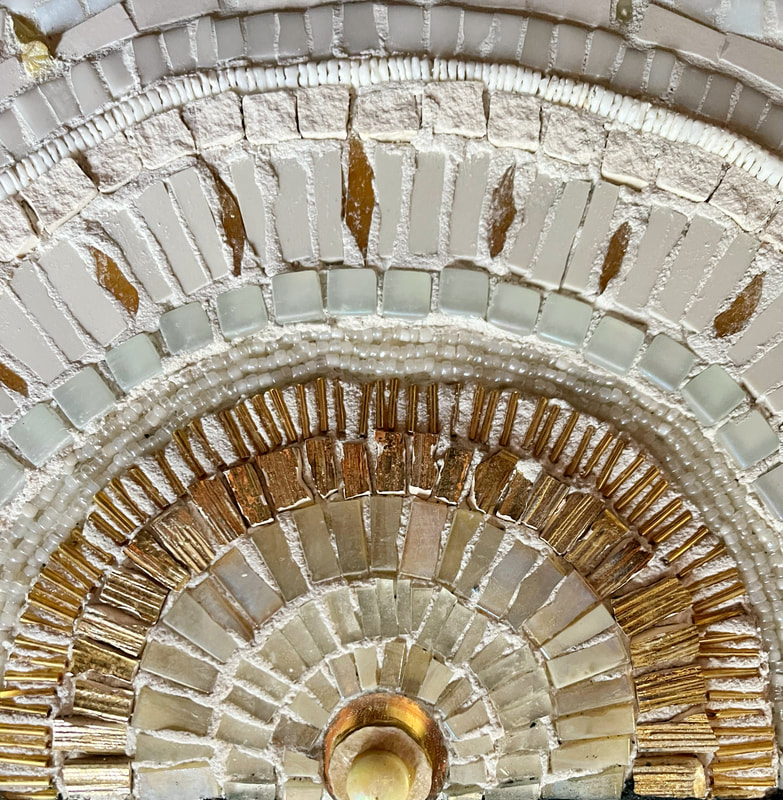 This piece took a little more planning than normal. I couldn’t use thinset to self-grout, because some of the stained glass is transparent and I didn't want dark thinset to alter the color of the glass, but I didn’t want the interstices within the blue water to be light colored, so I adhered the larger pieces with white thinset under the glass. I then had to go back and use the dark thinset between the larger pieces so that I could adhere the dimensional pieces within the interstices. As usual, I was messy with the thinset and had more cleanup than I should have. I never learn. 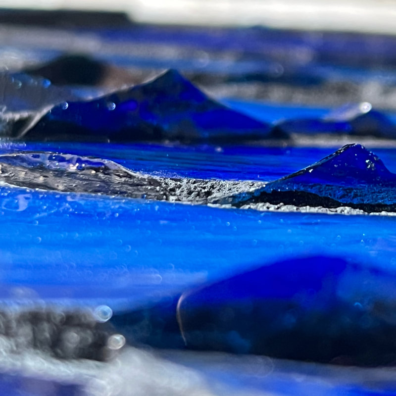 For the sky, I added a bit of off-white “aura” to the sun and created a slight contrast with the sky in a truer all white with white grout. 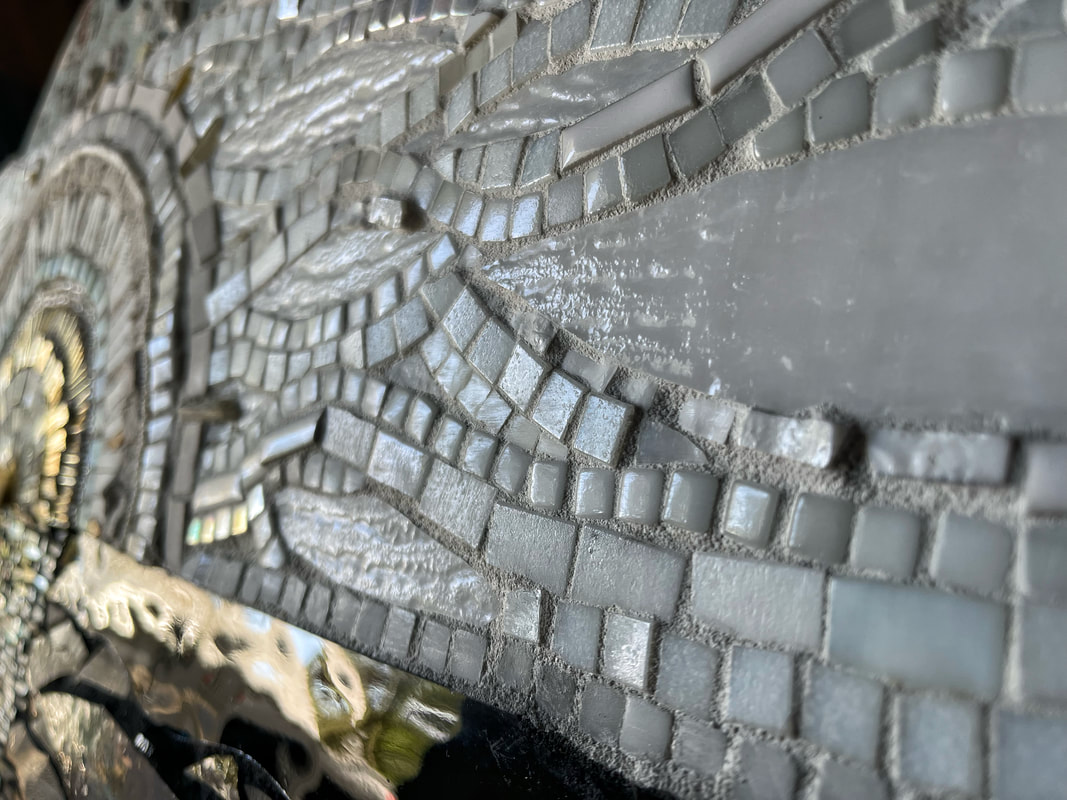 For the most part, this piece articulates the image that was in my brain (and the tweaked inspirational photo). Below is a short video of the piece coming together, from my initial sketch and notes through its completion. Locals may purchase this piece through Coastal Art Center of Orange Beach beginning March 11 during the Orange Beach Festival of Art. If you are elsewhere, please feel free to contact me. Measuring 21"x30", Sound of Sunshine can hold its own unframed, since the sides are finished with colored thinset. If framed, I would recommend a floater frame. Thanks for stopping by,  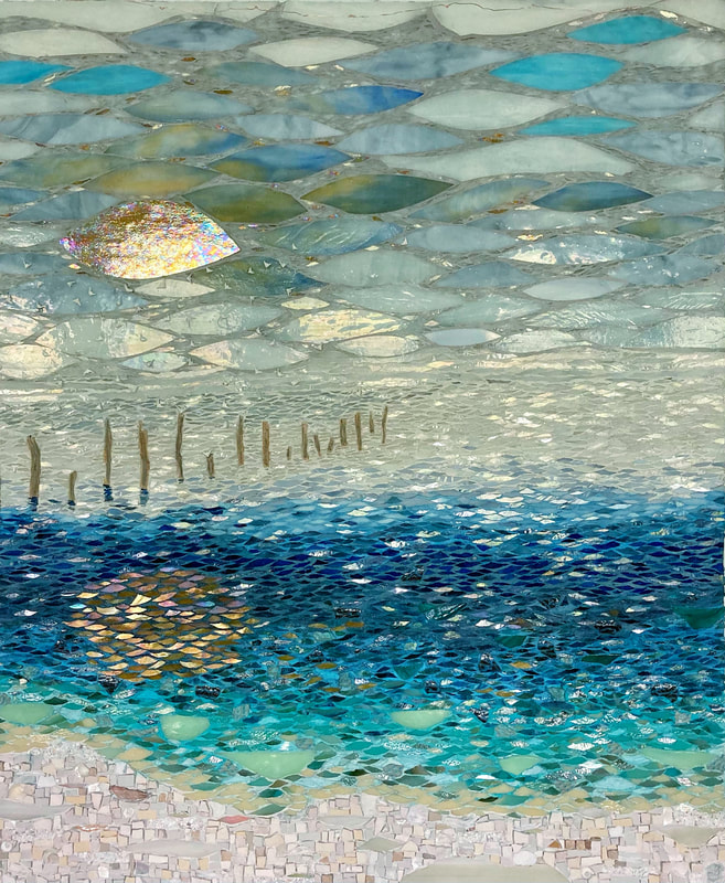 I consider myself fortunate to live in a coastal area. I find inspiration everywhere, from tiny treasures that wash ashore to awe-inspiring sunsets to the quietly lapping waters of the back bays. I also take a ton of photos. Some pretty good, others maybe not, but most do still serve to inspire me. Sometimes I will combine the elements of several photos into one concept for a piece of art. That’s what I did for The Fog. I live within walking distance to Arnica Bay, an offshoot of Perdido Bay which is part of the Intracostal Waterway system. Sometimes, the fog rolls in, blanketing everything in the tiniest of fine misty white droplets. So much so, that you cannot see across the bay. This piece started with a photo, that I then tweaked with an art app on my Ipad.
I will sometimes take liberties with what may not be an accurate representation of the colors around me or in my photo. I had some unusual elements that I also wanted to incorporate, so I also “cheated” a bit with my composition and added some seagulls. I love the way their dimension casts a shadow.
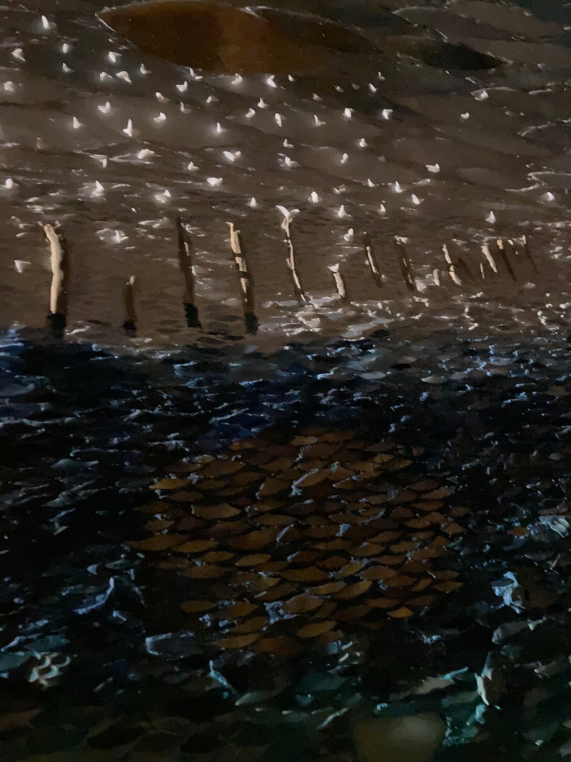
Below is a video of how the piece evolved, with each edit representing around one hour’s worth of work. Unlike a painting, it can be rather difficult to change your mind about the direction of a mosaic, and sometimes be pretty annoying when you have to pry up what you may consider a mistake. You can see that this happened a few times with this piece. Although literally The Fog represents local terrain, there is a deeper meaning to this piece. My sweet mother made it to the age of ninety and died just months before I began this piece. Of course, she was on my mind as I created it. My mother was a single mom for much of her lifetime and very resourceful with her limited income. She was a gifted teacher, intelligent, and patiently kind. A few years before turning ninety, the ravage of dementia appeared, robbing her of her once envied mind. I am grateful that she remained communicative and could still recognize me before she died, but it was heartbreaking to watch her mind fade. As I created this piece, I could not help but think of the analogy to "the fog of dementia." Below is the accompanying poem, which for me alludes to the way there are moments of clarity with dementia when "nothing is wrong" and then suddenly something misfires and the moment is gone. The Fog Clarity vanishes. Hijacked, Like a stealthy morning fog That sneaks in to bathe the unsuspecting. It swirls, taunts, and envelops, Then retreats to prepare for another certain ambush. Stolen moments of brilliance surface to Cleave the murkiness Claiming a celebrated, But provisional victory. Carolyn Wagner ©2021  *Scroll to end for update on this project. 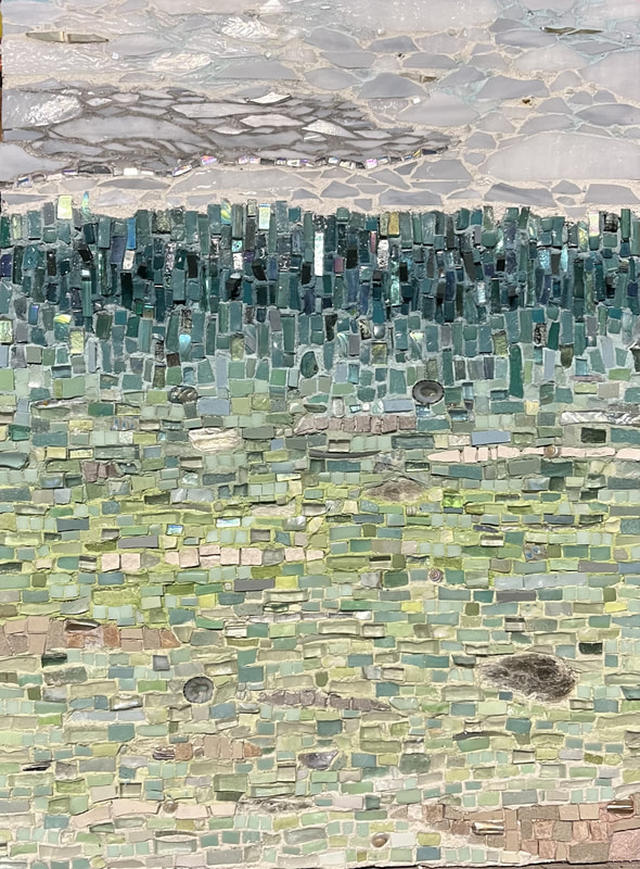 I recently finished a mosaic entitled Seacrets. It was a commission for a lovely snowbird couple who winters here in our area. They have supported me in the past and have purchased two of my other mosaics. The husband wanted to surprise his wife with another mosaic for Christmas. Their beachfront condo was in the process of a renovation, so I went down for a site visit to see the space. Rather comically, (I think), I was told the designated place of “honor” was to be directly above the toilet. Hmmm...okay… Once I actually saw its intended home, I could understand why that location was selected. The bathroom, though beautiful, is windowless and is the only one in the condo. Both the owners and their guests will face that wall as they enter the bathroom
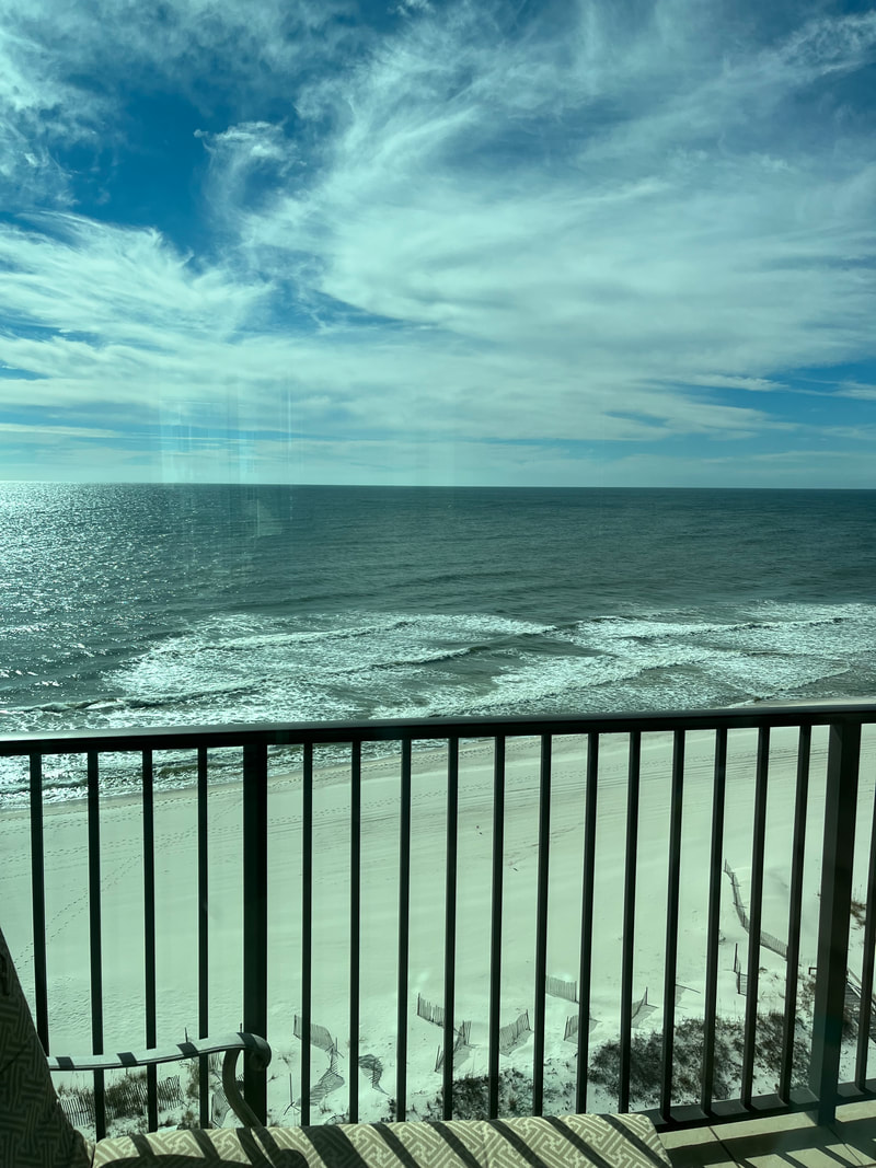
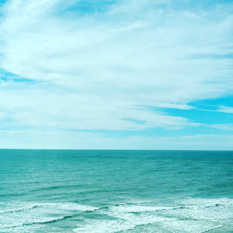
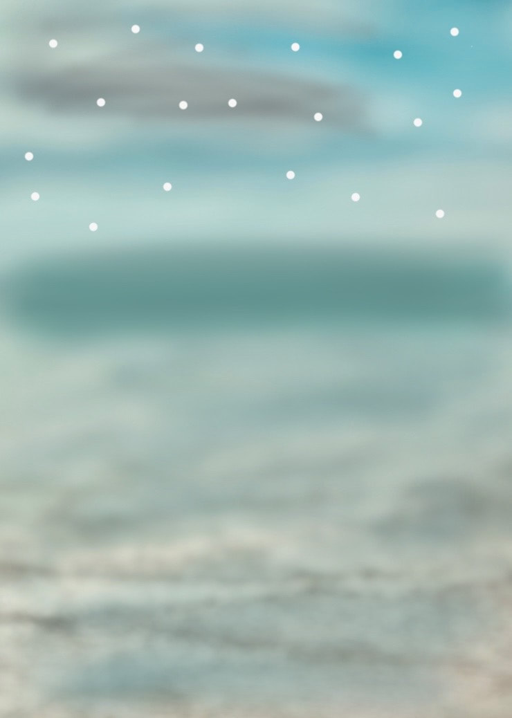
My only artistic directive from the husband was that he wanted the mosaic to be “organic”. I sent him some photos of materials that I had taken with me on the site visit, which included soft greens to complement their paint color and the shower tile. After some consideration, I decided the space called for an interpretation of the scene that was out of the window that did exist in their living room. With that in mind, and after a lovely gaze out of their balcony window, I decided to create a “fake window” for them with my mosaic. I took a photo, then manipulated it to a very blurry rendition altering the blues to more green hues, as if one were gazing out a foggy window.
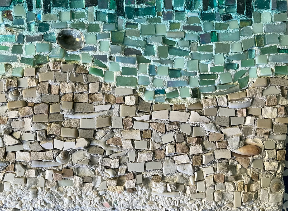
I then painted a "guide." Many times, I may paint a composition directly onto the substrate, or I just wing it. In this case, I was using tinted thinset as my adhesive, and just found it easier to place my painted guide beside me as I worked.  This is a very loose interpretation of a seascape. There is a lot of texture with incorporated stone, shells, chunky glass, and even within the way the material was placed. Like the sea, there are a few surprises. Some you may find if you look closely, and some are a little more hidden. I hope this mosaic evokes the same sense of wonderment as our lovely Gulf of Mexico. 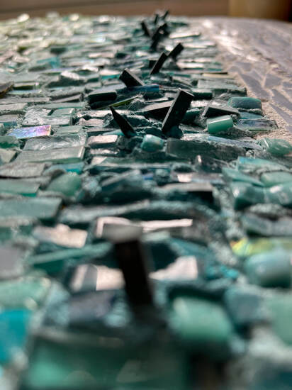 I am happy with how it turned out, and I do like the unexpected dimension one can see upon closer inspection. I also incorporated a few surprises for them, like glow in the dark stars that appear when the lights are off, and a few pieces of their leftover floor tile that I snagged from their discard pile. I wrapped the piece with hopes that the husband could wait until Christmas, so he and his wife could unwrap it together. I have heard from the client, and both he and his wife are pleased. Below is a video of how Seacrets came together. Thanks for stopping by,  *update: These patrons asked for a small companion piece to go along with Seacrets. Below are a few shot of 8"x6" More Seacrets. |
You’ve landed upon an occasional update about my latest project, an occasional rant about my life, or an occasional sarcastic snippet about whatever. It’ll be mostly positive vibes. I promise.
Archives
February 2024
http://www.backbaydesignstudio.com/blog
Categories |


 RSS Feed